

Usability and utility and not just finesse are the major determinants of the success or failure of a website. The ultimate judge of the effectiveness of a website is the user, and not the designer, so user-focused designs have become the gold standard for successful and profit-oriented web design.
This article outlines web design principles needed to create a technically and visually pleasing website. The same principles can also be applied to branding and marketing. The basic elements of a good design are shape, texture, direction, and color. When designers are creating a website they must strive to achieve a balance of visual appeal, responsiveness, functionality, speed, and usefulness. In order to achieve this balance, there are certain principles designers must follow. These principles are explained in detail in this article.
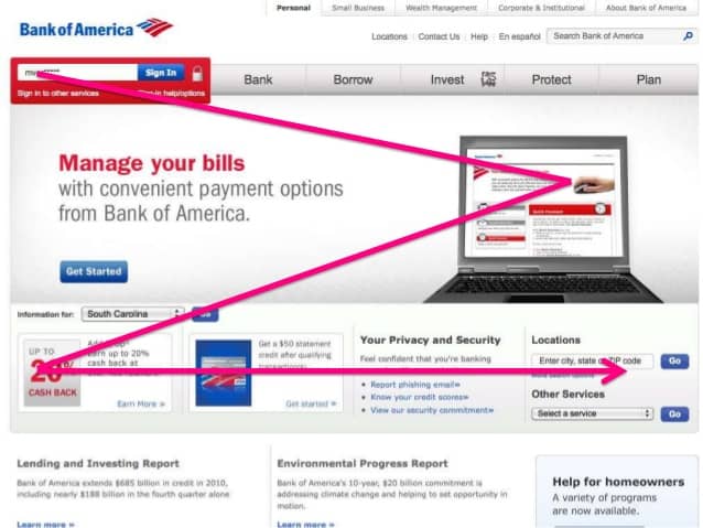
How people visually scan a website
Web Design Principle #1: Visual Hierarchy
The manner in which our eyes move from one item on a web page to the other is referred to as visual hierarchy. When designing a webpage, a designer needs to first categorize the various topics and thereafter, arrange them in order of their importance then place them in such a way that visitors first notice what is most important and move on to others in order of their importance.
A designer can create a visual hierarchy in order of the size of the most important image or content or create a hierarchy of content, from the most important content to the less important.
Web Design Principle #2: Design Intuitively
Many a time, users muddle through the content on a web page and when designing a web page, a web designer should strive to see the site from the eyes of the user and make it easy to read through so they know which way to go. The use of an intuitive and simple navigation helps increase the websites usability and make it more engaging so visitors won’t have to wonder about how to move from point A to point B.

Having too many choices is not good.
Web Design Principle #3: Hick’s Law
This law states that ‘with every additional choice increases the time required to take a decision.’ This law holds true not only in web design but in every other facet of life.
One famous psychology study showed that when giving consumers 24 choices of scented candles rather than 8, it resulted in less purchases. The extra options made the decision on which scented candles to purchase more difficult, and many consumers chose not to make the decision. So how many choices should you have? You want to give consumers a choice, but not a difficult choice. You want one option to stand out to consumers, so it doesn’t take much cognitive effort to decide. If you are printing t-shirts for example, you will likely want to include 1, maybe 2 shades of blue, but you wouldn’t want 10 different shades of blue.
The more options you create for visitors using your website, the more difficult it is for them to come to a decision, this means you have to reduce the number of choices in order to create a better user experience. Distracting options have to be screened out to aid increased sales and better overall profit. You want to make things simple for your customers. If you need to have a lot of choices for products on your website, you can use filters to help people narrow down the selection.
Web Design Principle #4: Fitts Law
This law states that ‘the time needed to move to a target is dependent upon the size of the target as well as the distance to the target’. Simply put, the larger an object or target and the closer it is to us, the easier it is to use it.
This law can easily be applied when designing a website. Design your website so that what people are looking for is easy to find on the page, and easy to see. Make popular content standout to improve the usability of your website.
If you notice in your website analytics that a lot of people are searching for a particular topic, make that topic standout. Don’t make people scroll all the way to the bottom of a page for what they are looking for. On many popular music websites, the play button is much larger than either the reverse or fast-forward buttons beside it, these companies have applied this principle to improve their usability. This doesn’t mean you put buttons which cover half the screen; you have to use some discretion when applying this principle.
Web Design Principle #5: White Space and Simple Design
Simplicity should be the primary goal of web design. One of the most important features of a simple design is white space. White space not only unburdens users of the stress of identifying the information but makes it easier for users to perceive the information on the website.
White space helps divide the web page into several parts, which makes it easier for the user to process the information on the site and it also helps to solve problems of complex hierarchical structures.
Web Design Principle #6: Communication and Content
Visitors to your website come with a want which they want solved and this solution can be in form of entertainment or relevant information and it is important you communicate with your audience in a clear and engaging manner. This information usually can be in written form, in the form of images, videos, or audio pieces.
The visible language users usually see on a website should be formed with three principles in mind:
• Organization
• Economy
• Communication
Beside these sub-principles, the content on the website must be well-written, appropriate, easy to understand, and written with search engine optimization in mind.
Web Design Principle #7: Test Early and Test Often
This is a principle all web designers and website owners must consider. Testing the usability of the website every now and then provides important insights on complications and problems related to the website design and functionality. Asking someone who is unfamiliar with the website to visit and explain their experience can also be valuable. When websites are not tested often, certain issues may pop up on the site, which adversely affect visitors.


