A company’s brand is the symbol which represents its business and embodies all of its characteristics, associations and experiences. This brand can be in the form of consistent imagery, phrases, sounds and logos with which people come into contact.
Building a website is seen as a rite of passage for most business and start-ups; even when the business is still to make a cent. Why? A website serves as a virtual business door where old and new can come through, explore and enjoy the services your business has to offer. However, to make your website stand out in this sea of websites, uniqueness is key, so is building a website which promotes the unique brand values of your company.
Building a website has been made a lot less technical with the availability of templates to help website builders build websites. Good as this may be, it makes the job a bit too easy for some website builders hence they just create websites which though functional aren’t built to your specific brand or niche. So as a business owner looking to build or revamp your website, it is imperative you know what to look out for in a website so you know when a great or sub-stand job has been done for you. Some of these things include:
COLOR
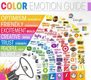
Colors aren’t just for aesthetic purposes; they stimulate different emotions and carries subconscious associations to various characteristics and things. For example, the color red, it signifies danger, excitement, love and power and this makes it a great choice for the arts and entertainment industry. So do other colors represent different things and elicit unique emotions. So when building a website, its important you research on the meaning of the colors unique to your type of business.
CHARACTER

Infusing some personality into your brand can help define what it stands for. You can do this by infusing some human characteristics into abstract shapes and figures or you can use particular objects or animals to represent what your brand stands for. For instance, the blue bird mascot on Twitter has proven very effective or the Wild West design in Outlaw Design blog serves as a personality which represents what the company does.
CONSISTENCY
Consistency in the image your brand portrays .on your website makes it not just neat but memorable to clients as the have a definite image associated with your brand. This consistency can be in the choice of colors, themes and typography. This consistency can be seen in the website of two of the top brands out there; Twitter and Skype with their famous blue colors, and on other household brands like Facebook, Instagram and Google.
SIZE AND POSITIONING OF LOGO
The size of your company logo on your website should be large in relation to most of the items on your website so it is easily noticed by customers. In addition to the size of the logo, the position of the logo should stick to the tradition, usually on the top left of the web page and should link directly to the home page of your website.
TONE OF VOICE
Just as we won’t expect the choice of language on a website for a pop group to be same as that of an audit firm, so it goes with whatever it is your brand portrays. The choice of words and the tone in which those words are said should be tailored to your brand and audience.
Branding is important not just for big corporations, but also for small business, websites and blogs even as it helps customers identify your business among competition and form an opinion on the company.
![]()

